
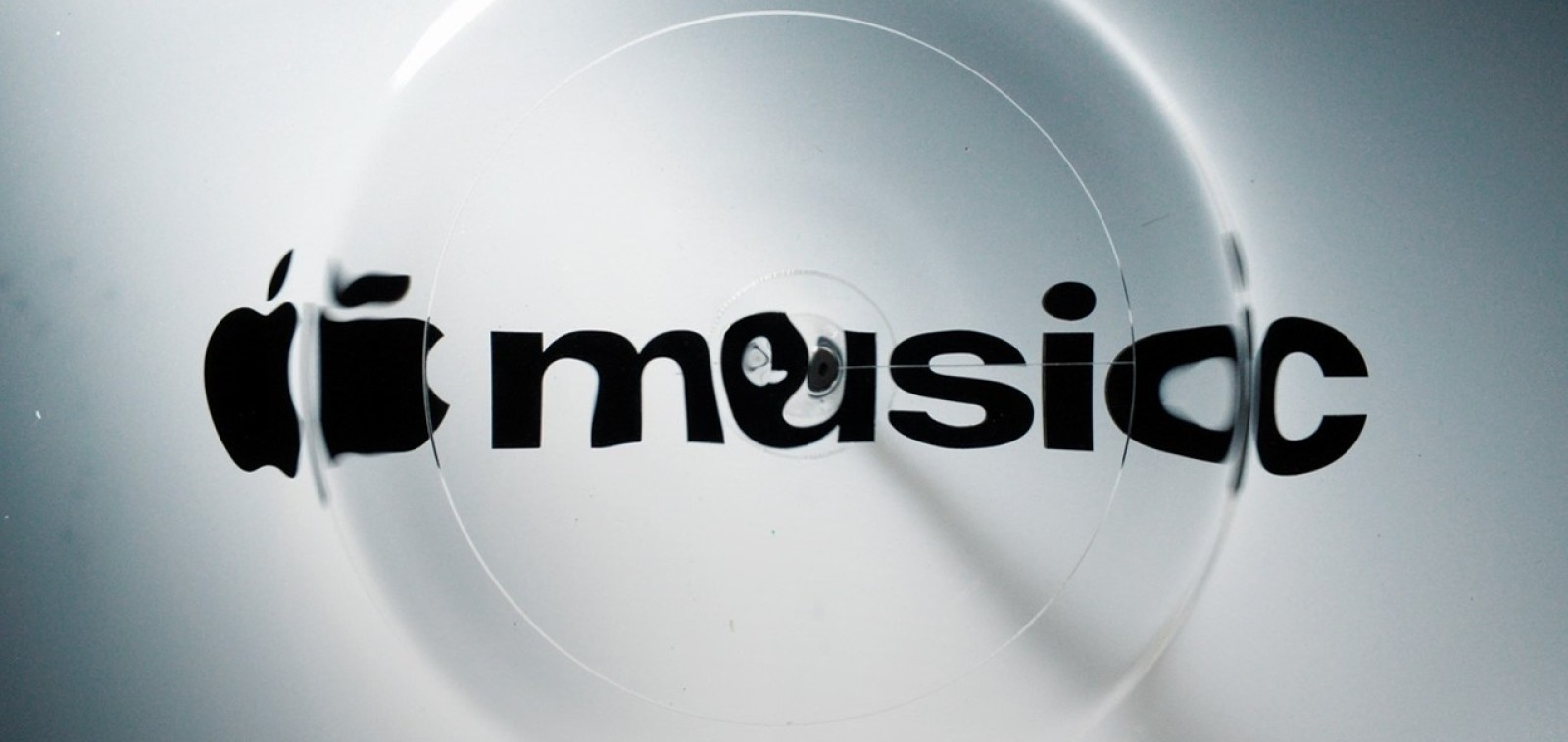
The Apple Music rebrand is officially here, and one of electronic music’s most influential producers is part of its DNA. On October 21, Apple unveiled the full visual identity of its streaming service, a look the company says was “made by sound.” The new logo and visuals were physically shaped by an original composition from Fred again.. and the sound design studio NEST Acoustics, then captured entirely in camera.
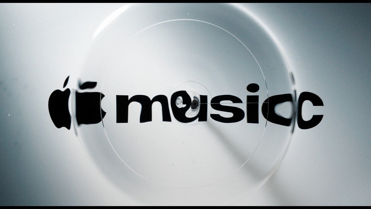
How the Apple Music rebrand was made by sound
Instead of building the new look in software, the team turned music into physical movement. Individual notes from the composition were played through a transducer, a device that converts audio signals into vibrations, placed in a shallow bath of mineral oil. As the oil rippled at the frequency of each note, it bent the light passing through it and warped the Apple Music branding inscribed on the glass base underneath.
Cameras filmed those ripples and refractions, and the footage became the raw material for the logo and the motion graphics that surround it. Apple describes the result as captured entirely in camera, with no CGI doing the heavy lifting. It is the same practical philosophy the company applied to the refreshed Apple TV intro last year, this time with a producer’s music as the engine.
Announcing the identity on X, Apple Music said it was “physically shaped by an original composition from Fred again.. and NEST Acoustics.” Beyond the visuals, the collaboration also gave the service a short musical signature, a new sonic identity designed to sit alongside the logo across Apple Music content.
Goodbye red, hello black and white
The most visible change is the color. Apple Music is moving away from the red and pink gradient that defined it for years and toward a black and white palette, where the energy comes from liquid distortion and flashes of refracted color around the edges of the icon.
The wordmark has been reworked too: a heavier, lowercase “music” based on Apple’s SF Pro typeface, still paired with the Apple symbol. The glassy, rippled treatment fits neatly with Liquid Glass, the design language Apple introduced across iOS 26 and macOS Tahoe.
The reveal came in stages. Apple first showed the new logo on October 6 and the new app icon on October 13, before publishing the full identity and its behind the scenes film on October 21. The updated wordmark had already surfaced in September during the promotion of Apple Music Hall, the company’s live music venue in London.
Why Fred again.. makes sense
Picking Fred again.. for this job is not random. Few producers have done more to blur the line between sound and image. His records are built from voice memos, found audio and everyday moments, and his live shows lean on raw, handheld visuals that feel as personal as the music. Translating an original composition into ripples of oil is a natural extension of that approach.
He also has history with the platform. Earlier this year Apple Music released a live film from his USB tour, and the British producer has been one of the most visible electronic artists in the streaming era. His recent work keeps expanding into collaborations outside the club, like his project with Brian Eno. Having his music literally shape the face of one of the biggest streaming services in the world is a strong statement about where electronic artists now sit in the wider culture.
When the Apple Music rebrand reaches your devices
The black and white icon already appeared during the iOS 27.2 beta cycle. The full rollout arrives with Apple’s next software releases, iOS 27.2 and macOS 27.2, which MacRumors reports are expected next week. From there, the identity will spread across Apple Music marketing, original video content, live events and the app itself.
For a company that usually guards its brand with obsessive control, handing part of the process to vibrating oil and a producer’s composition is a notable shift. The look is cleaner and quieter than the old red, but the idea behind it is loud and clear: music first, then everything else. For more on how sound and hardware keep shaping DJ culture, read our piece on the Technics SL 1210MKX.